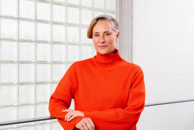
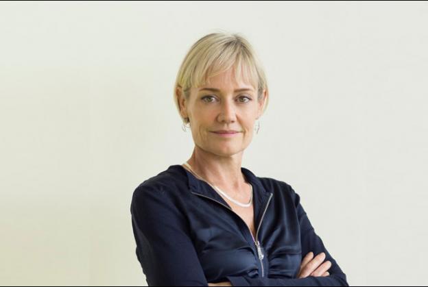
Christina Seilern – Principal, Studio Seilern Architects
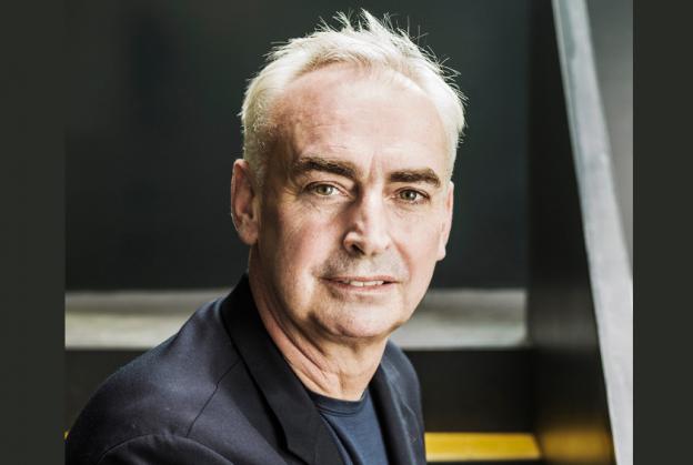
From the majesty of her native Swiss Alps to the high-rise, fast paced streets of New York City, Founder and Principal of Studio Seilern Architects, Christina Seilern, has always been influenced by her surroundings. After being inspired by a lecture by Rafael Viñoly at Columbia GSAPP in NYC as a student, she secured a job with him (with a little persuasion) and went on to found his London studio in 1998, working on such high-profile projects as the ‘Walkie Talkie’ in London, and The Curve Performing Arts Centre in Leicester, UK.
In 2006, Christina struck out on her own, founding her studio after working on a challenging but inspiring brief in Zimbabwe. Renowned for her work in the field of performance and cultural spaces, we ask her where this affinity with the arts and acoustics originally sprang from, and take a closer look at some of her best-known and loved projects…
Firstly, we’d like you ask you about your obvious passion for performance and cultural spaces. Does this stem from working on The Curve, or earlier?
My mother used to take me to Salzburg as an adolescent. I remember being as excited about the complexity of the urban layout of Salzburg as the music that resonated throughout the city during the Festival period. I was struck by the notion that the hall was seemingly built into the cliff. It felt like you were in a fort for music…
Performance and cultural buildings are considered as one of the most challenging and technical typologies of architecture. They are usually the landmarks of the city with the need for flexibility for multi-purpose functions and require a level of complexity to meet a perfection in performance for both audience and musicians. I enjoy the challenge and the technical side of it very much.
Working at Rafael Viñoly Architects (RVA) obviously introduced me to the world of performing arts buildings. In fact, when I started there, I was placed in the model shop to build the Kimmel Centre for the Performing Arts model. Meticulously placing the tiniest of chairs into place, one after the other, is something that I will always fondly remember. It also gave me the opportunity to spend hours with the design of the building, and hence gain an understanding of how it was built, and why.
We were struck by how one of your most recent projects, the stunning Andermatt Concert Hall in the Swiss Alps, turns the conventional notion of a performance space being ‘inward-looking’ on its head. Can you explain to us the concept behind creating a space that links the indoors with its scenic setting?
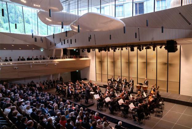
The notion that performance must be in a closed air-conditioned space always baffled me. Why not allow nature and music to co-exist? In Andermatt, we allowed the elements of the mountains to be part of the concert experience. The audience can see out onto the ski slopes, while allowing a horse-drawn carriage slowly meandering by to become part of the experience. We wanted to emphasise that this was a concert hall in the mountains, rather than an urban setting.
We design spaces based on a project’s existing context, landscape, weather, or culture. We try to include elements of the natural environment into our projects. When occupying a site, we look to give back to its environment as much as we take from it.
And with the Andermatt project, how have you achieved this in practice?
In Andermatt, we were asked to transform an existing underground space originally intended for conferences and events for the adjacent hotel. Initially, this underground concrete box had a limited effective volume of approximately 2,000 m3, which was insufficient for classical concerts larger than chamber orchestras.
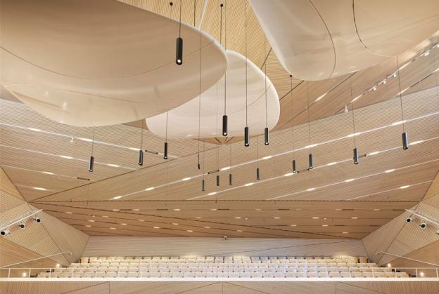
We proposed to lift a large section of the existing roof, thereby increasing its effective acoustic volume up to 5,340 m3. This created a space that could now accommodate a symphony orchestra and a total of 663 audience seats.
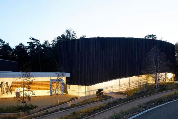
The raised and extended roof creates a covered plaza and an alternative entrance to the concert hall, allowing it to be independently accessed from the adjacent hotel, with the extended steel roof cantilevering above the road and providing a sheltered space for the pedestrians. The large, glazed windows offer a ‘sneak-peak’ into the hall. Music, weather, snow, wind, are all allowed to mix and add to the experience of the concert.
Also, there is a real juxtaposition between curves and angles reflected in the interiors. What was the thinking behind that?
Early reflections of reverberation are necessary for providing excellent speech intelligibility, musical clarity, presence, and a sense of being acoustically enveloped by the music. They will be provided naturally by the optimised interior topography of the hall to reflect the sound from the stage to every part of the audience.
Surfaces such as the inclined balcony fronts and the sculptural timber ceiling wrap the space as a wave rising from the ground to give the audience the impression they are inside of a wave of music, which is visually and acoustically enhanced by the interior geometry of the hall. In addition, the suspended acoustic reflectors guide the sound from the musicians to arrive at the listeners with the necessary intensity, direction, and time delay to create an involving and immersive acoustic experience.
The glass window is the one with the curve. This is because we wanted it to disappear, and a corner is never transparent. It defines a real boundary, which a curve avoids.
Moving from the Alps to Egypt, the Gouna Conference and Culture Centre forms a striking oasis, set in the centre of a lagoon, in the new resort town of El Gouna. In what ways have you managed to incorporate references to traditional Egyptian architecture into such a modern facility?
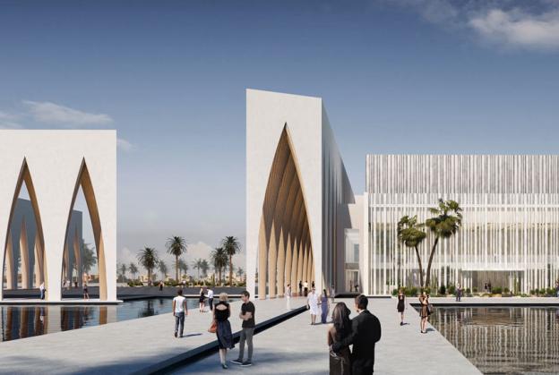
The building’s inspiration is rooted in Middle Eastern and Egyptian traditional architecture. The monumental scale of ancient Egyptian architecture was a guiding factor in the conceptualisation of the scheme.
A series of arched barrel vaults surround the auditorium and its supporting functions, and provides a shaded perimeter layer, where inside and outside merge as they are framed by a sculptural contemporary interpretation of the traditional arch. Such features have a strong presence in many cultures, including ancient Egyptian architecture. The passion for this motif is due to the mystical and symbolic meanings associated with it, as well as its functional advantages. It is used as a major structural and decorative feature.
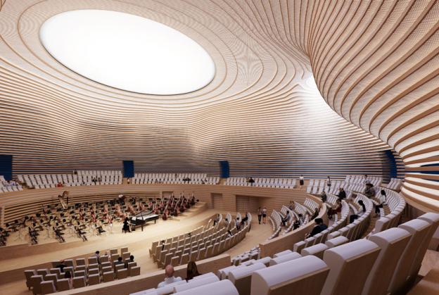
The interior of the concert hall is inspired by the impressive atmosphere and the spectacular textures of the rock formations revealed by the sun’s rays in the canyons and caves.
Can you give us a little more detail about these impressive monumental arches?
The arches in Gouna Conference and Culture Centre vary in height, from the taller ones at 20m, to 18m and 16m. These frame the concert hall and its foyer and create an interesting play of light as they are reflected in the surrounding lagoon. Staggering the arches in plan creates a rich and unexpected ribbed interior structure; something reminiscent of Gothic architecture, with a bold and textured outcome. The colonnades work as circulation areas as well as monumental gates, inviting people to the courtyard and the hall. Wide pedestrian bridges stretching over the shallow reflective lagoon, allow people to access the courtyard and concert hall.
The award-winning G W Annenberg Performance Arts Centre at Wellington College in the UK is another fine example of a Studio Seilern arts project. Here, the original theatre has been linked via a glass-fronted ‘public square’ known as the Cultural Living Room to the new Performance Arts Centre. The rationale was to create space for spontaneous performance and relaxation in the former, and formal performances in the latter. Since the building was completed, how has that been playing out, especially in these days of social restriction?
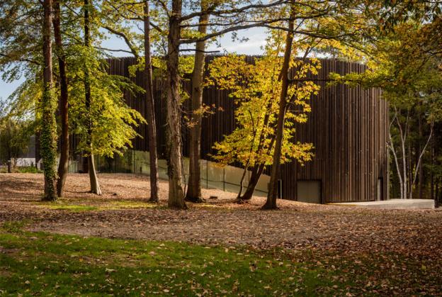
The students enjoy the arts complex, especially the public square, because it is vibrant, open, filled with natural light and boasting a large window overlooking a neighbouring forest.
Nowadays all schools in the UK have new rules for their daily operations and social distancing. The idea behind the addition of the Cultural Living Room was beyond that of a foyer. We wanted students to take over the space and make it their own. This is now all the more relevant, where being confined in one space is problematic for the Arts.
Also in the UK, we find the Albion Barn Gallery, a residential and cultural exhibition space in Oxfordshire, designed for a private art dealer. Arranged within a number of old farm buildings, the complex features gallery spaces of differing scale. Can you describe one of the project’s most intriguing aspects - its library and some of its more unusual features?
We were invited to convert the old farmhouse buildings into art galleries, where the architecture would react to the intimacy of its domestic setting. The 325m² project on Old Belchers Farm also includes a dining room and offices wrapped around an intimate, hidden central library with four secret doors.
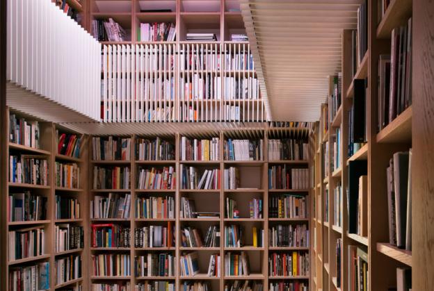
The library is conceived as the focus of the building, a transitional and pivotal space between the private and public spaces. The idea was that once inside the library, one should feel fully surrounded by books, rather than walls.
The space is galleried, and the ceiling mirrored, giving the sense that the library extends vertically into infinity. The illusion is then broken by an oversized pink skylight, puncturing the ceiling into a deep void, giving a soft and warm natural glow to the books. The four walls are covered in full height bookshelves, within which four secret doors have been integrated. When closed, the space seems to have no exit, and one is fully immersed in this extensive and wondrous art book collection.
As mentioned, one of your most notable projects has been The Curve. The stated mission for this theatre complex was ‘to engage its activities with the lives of local communities as a way to reach beyond the traditional idea of performance as a form of suspended reality and to elevate it into a form of knowledge’. How did you set about achieving this?
We were at a time when we were wondering whether the theatre was a dying art form, losing its audience to the digitalised world. I remember during the competition going up to Leicester to see how they operated as a theatre. At the time, the Haymarket was located on top of a supermarket, with zero street presence and generally alienated from the city, and its audience. They had staged a piece called ‘Foyer’, where the art spilled outside of the auditorium into the public space. It became very quickly evident that what they needed was to be released into the public realm. And this is where we developed the idea of the ‘theatre turned inside-out’.
The new facility exposes the production, construction, craft and technical components of the building to the public, thus offering itself as a total resource for professional artists and community members to make and share the theatre experience. This is made possible by re-thinking the traditional notion of the architectural membrane for a building of this type.
We negotiated with the city that the street fronting the theatre should be pedestrianised, so it could become a full extension of the stage, allowing performances to occur in the street, in the foyer and on the stage.
After RVA, you left to set up your own practice in 2006. When you did this, how easy (or difficult) was it to win more of this type of work? What were some of the barriers for a new firm such as yours?
I opened Studio Seilern Architects on the back of a wonderful project in Zimbabwe: an ambitious one-off house on a rock for a delightfully eccentric couple. I understood that it would take time to grow the practice, while competing with the larger firms. Most clients tend to be risk-averse, so we had to source the clients who would be engaged in the vision, and happy with the journey. These tended to be individuals with strong personalities, and no shareholders to be accountable to!
Have any of the briefs for your current cultural projects changed on account of Covid-19, also across other sectors such as schools, offices and residential?
Of course! The entire cultural sector is heavily affected by Covid-19. This has put many projects on ice, and, in our case, has just slowed down the process. While we were supposed to complete the second stage of construction for Gouna, we are taking more time designing more carefully and being more cost-effective. So, overall, a positive effect. Gouna was always designed to have outdoor performances, which helps with assemblies, but we still have no sense as to when it will all be back to normal.
Although perhaps best-known for your work on cultural and educational projects, you are now working across a wide spectrum of sectors; is this something you have actively sought to achieve?
I try to strike a balance between big and small projects, and work across a wide spectrum of sectors because of the experience I had for the first SSA project in Zimbabwe. The change of scale, of client body, or construction environment meant a complete recalibration of my mind set.
The meetings were no longer in a large conference room with 20 consultants and tepid coffee, but around the dinner table with a glass of wine. The discussions were personal, the professionalisation of the interaction with the client needed to be toned down, to get to the essence of the project. It was a labour of love, and a challenge that was equally shared between the client and the architect. Something magical happened, something that I had not expected, and could not name…an intimacy in the building process.
Larger projects can often be over-corporatised in the process, thereby missing the intimacy of the human soul. In these important, but smaller projects I found a dialogue which was possibly more visceral and intuitive, and as a result brought surprise and delight to the delivery.
And what does the future hold for Studio Seilern?
At SSA we are now working mostly on larger new-build commissions, ranging from concert halls and offices to hotels. But we continuously seek and keep looking for a balanced portfolio of work that includes both large and small scale, where one informs and feeds the other.
The variety in building typologies is simply a reaction to the notion of ‘specialisation’ in architecture, which for me is synonymous with death of the agile mind. We operate like young minds with a number of years of experience, and we try never to be formulaic; or pretend that it can only be done one way.
On a more personal level, having grown up in Switzerland, you chose to study architecture in the United States at Wellesley College, then Massachusetts Institute of Technology (MIT), then Columbia University in New York City. What made you chose to go to the USA? Is that where you first encountered Rafael Viñoly?
My parents met in the US and always talked fondly of their time there. Having grown up in the very sheltered environment of the Swiss Alps, reaching Boston on the first day of college was thrilling. The buildings were oversized, the pace was fast, and the campuses were highly impressive. I started at Wellesley and joined the MIT design studios, as Wellesley did not offer architecture. The mix of culture, nationalities - the foreignness of it all - was inspiring.
I heard Rafael’s lecture at Columbia, where he talked about a specific construction detail of the Tokyo Forum. This was in the midst of the decontructivist academic and theoretical environment of Columbia GSAPP. It was refreshing and I was completely sold! I had to practically beg for a job there [RVA]!
You once said that the building you find most moving is the Saarinen Chapel at MIT. It is certainly a very arresting space with its circular brick structure, natural light from a sky-light high above the altar filtering down onto a curtain of metal pieces to create the impression of an ever-changing waterfall of light. But what is it about the chapel specifically that moved you? And has it influenced and inspired your own work since?
I had to draw the chapel as my first assignment of my first architecture studio at MIT. My knowledge of theory or architecture in general was limited to experiences only. It was the first time I physically encountered a modernist building driven by the poetry of light and sound. It mesmerised me.
Every visual encounter inspires or influences one’s work, whether it is a marble quarry, or the shape of a hat. I often talk about how we educate our children cerebrally, but that the visual education is often overlooked. Thankfully my mother would drag me as a child on cultural trips, which I now try to do with my children (at their great despair!).
What might we find you doing when you’re not working?
I have three children, so I enjoy the family life enormously. I do a lot of sports; skiing, hiking, biking, surfing, riding, playing tennis. Anything that will get my adrenaline going.
And mostly I love being in the mountains. In the winter, my husband and I will climb up the mountain with skins on our skis to be alone in nature, away from the crowds and the skiers…and on top of the world. It is where I recharge.
And lastly, Studio Seilern Architects has recently become a member of TenderStream. Have you found the service valuable so far?
TenderStream is a wonderful platform for us to keep track of upcoming business opportunities. It’s easy for me to spot the potential projects and ask one of my colleagues to follow up on them.
Interview: Gail Taylor
IMAGE CREDITS
Portrait Image Credit - Emma Hardy
1 - Andermatt Concert Hall - Roland Halbe
2 - Andermatt Concert Hall - Monika Rittershaus
3 - Gouna Conference and Culture Centre - Studio Seilern Architects
4 - Gouna Conference and Culture Centre - Studio Seilern Architects
5 - G.W. Annenberg Performing Arts Centre - Hufton + Crow
6 - G.W. Annenberg Performing Arts Centre - Kanipak Photography
7 - Albion Barn - Philip Vile
8 - Gota Dam Residence - Angela Gedds
